plapperegg
Logo, Illustration, Brand Identity,
Website Design, Stationary & Marketing
Plapperegg is a child-friendly speech therapy practice in Zurich that helps children develop their communication skills from early childhood through school age. I collaborated with Plapperegg to create a brand and digital experience that engages both children and parents, fostering trust and connection. The cheerful design and delightful illustrations emphasize joy and free expression, making the concepts of speech therapy accessible and memorable for parents and guardians.
NAMING
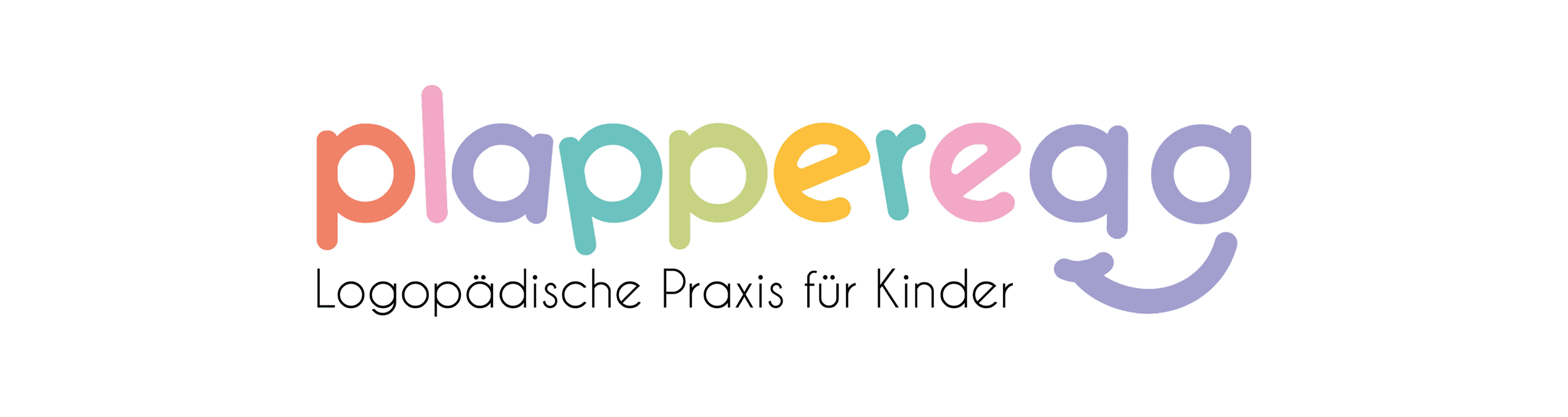
The name plapperegg was derived from "plappern" for speech therapy support and "egg" as a nod to "Ecke" for more approachability.
LOGO
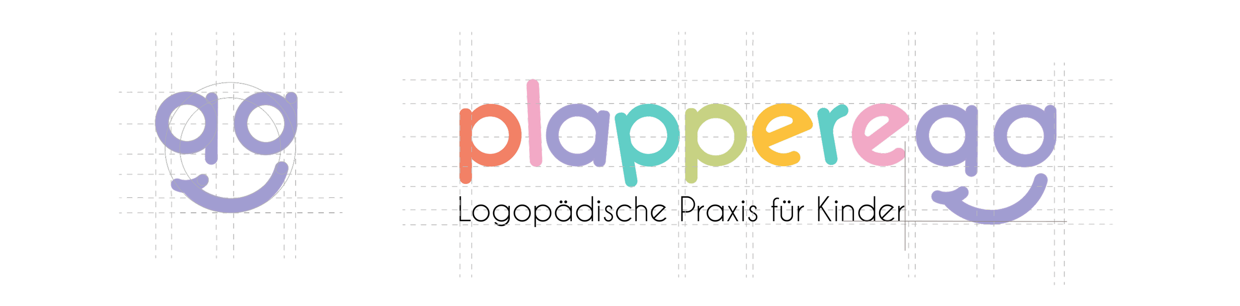
The wordmark is bold but appears friendly and inviting due to its rounded design. The logo represents the speech therapy practice for children by combining professionalism with a child-friendly lightness.
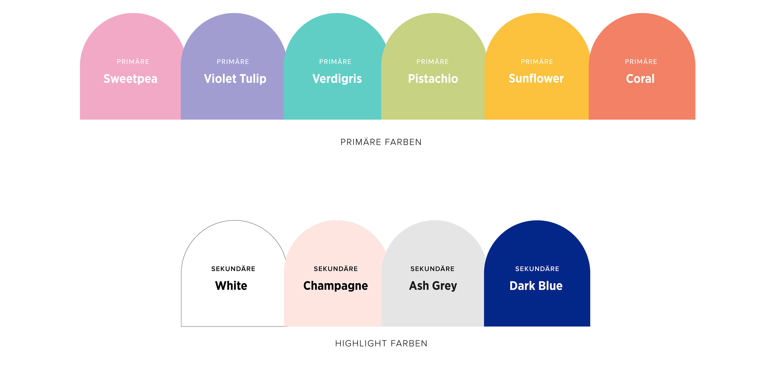
COLOUR SCHEME
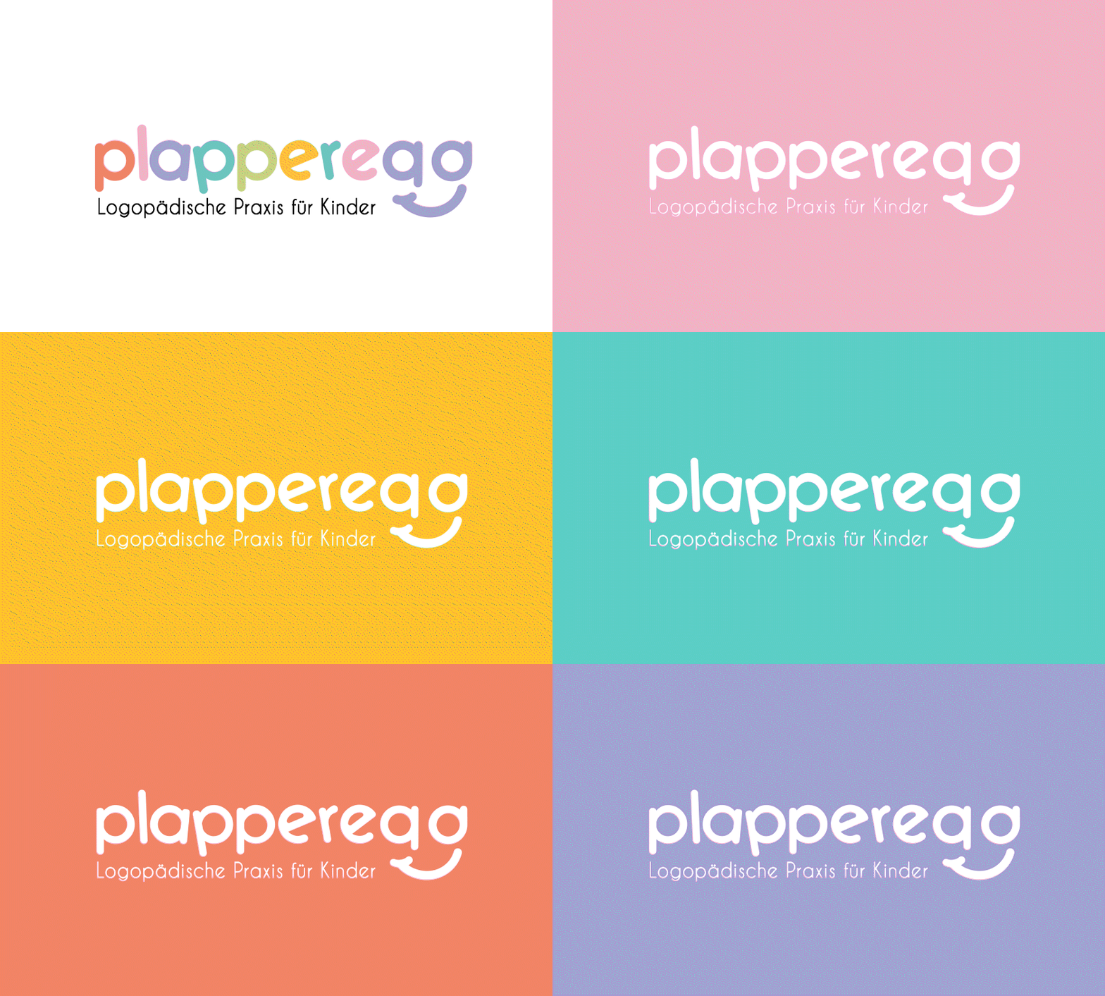
The soft pastel colors were deliberately chosen to create a calming and child-friendly atmosphere in the practice.
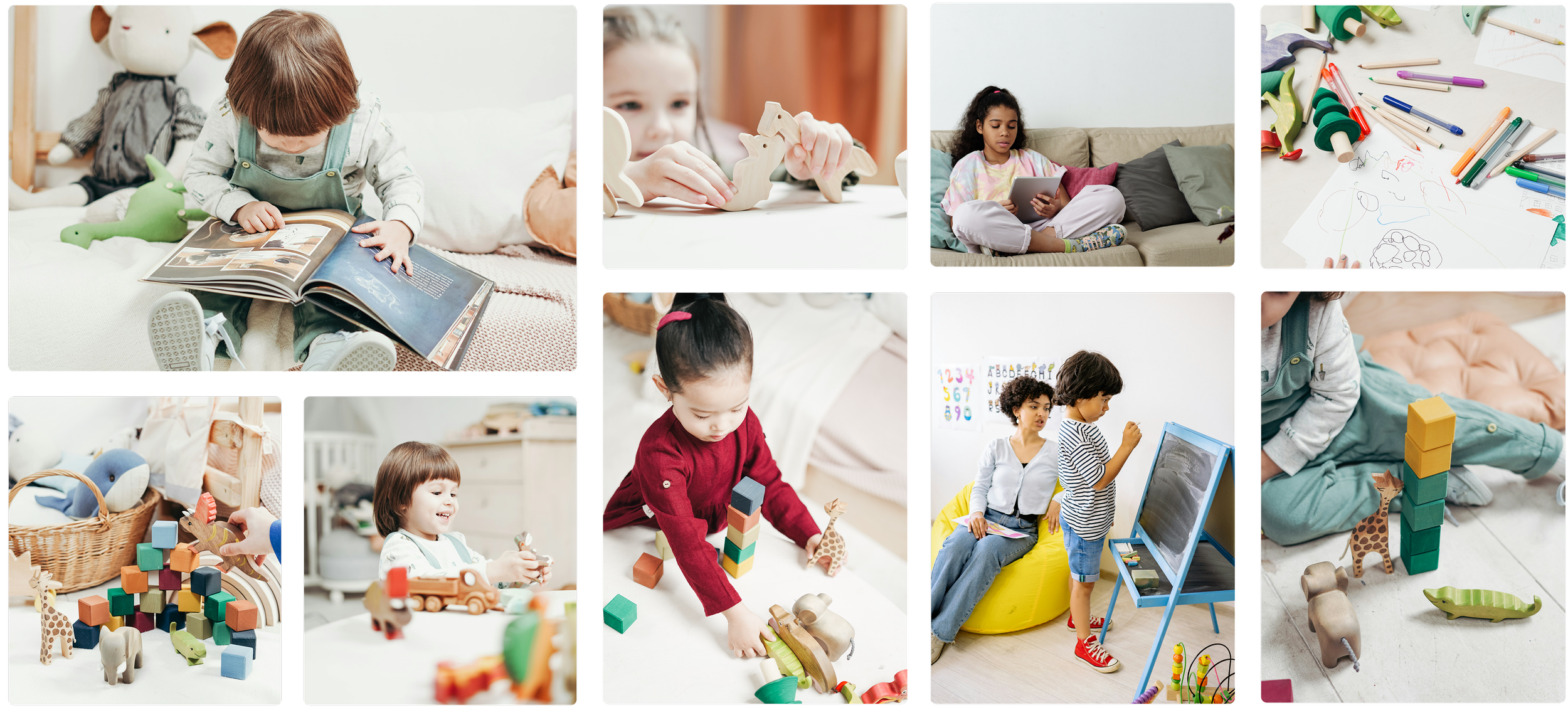
IMAGERY STYLE
The imagery showcases diverse children in an inviting, bright, and colorful setting, reflecting an environment that is welcoming and child-friendly, ideal for speech therapy practices.
KEY VISUAL
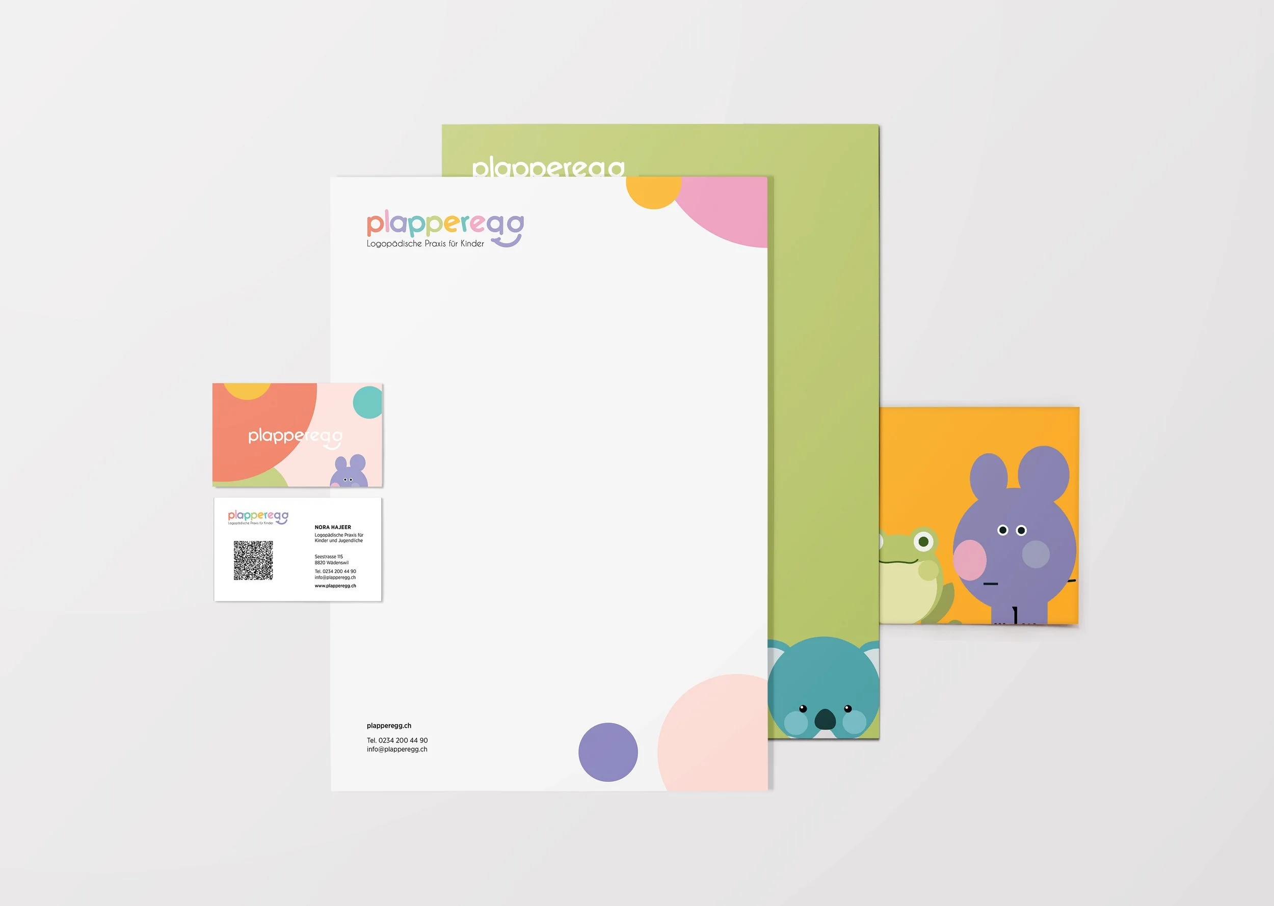
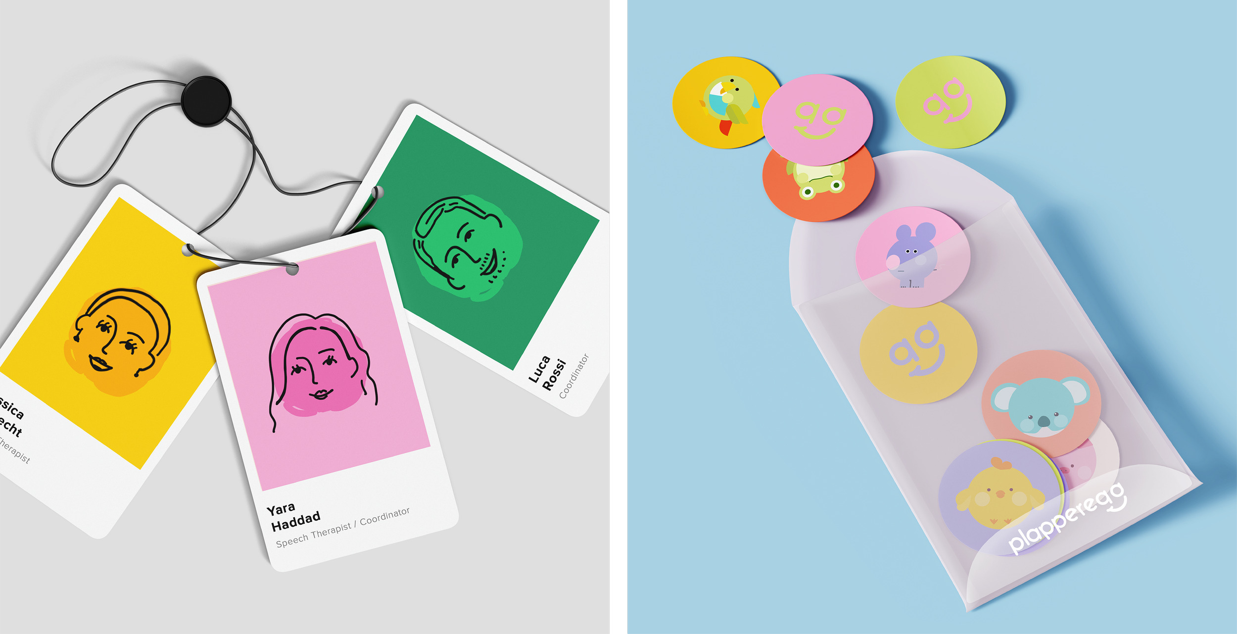
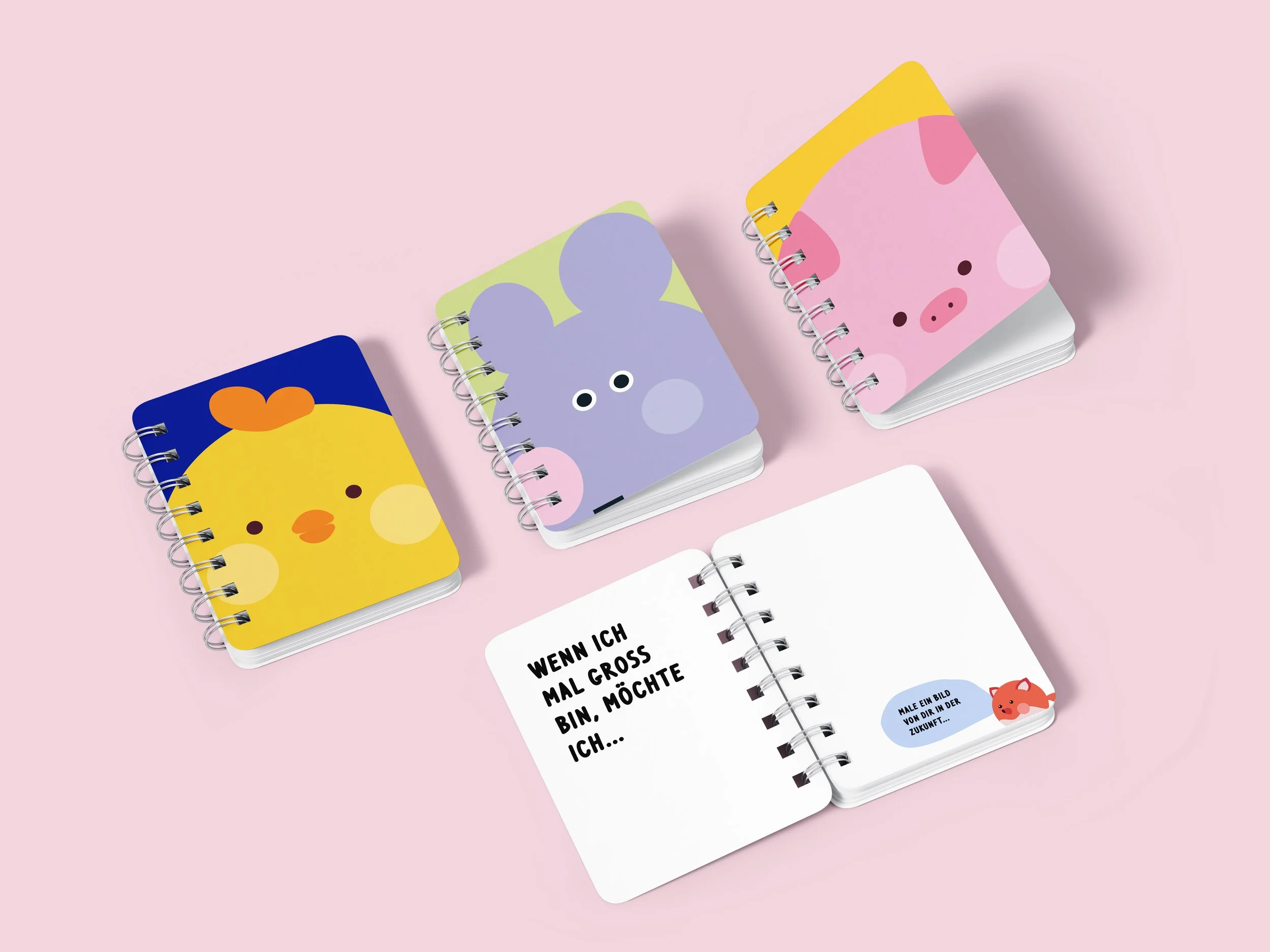
The pastel tones and round design form the basis for developing the key visuals, distinguished by animal illustrations. Simplified and recognizable, they create a unique design system
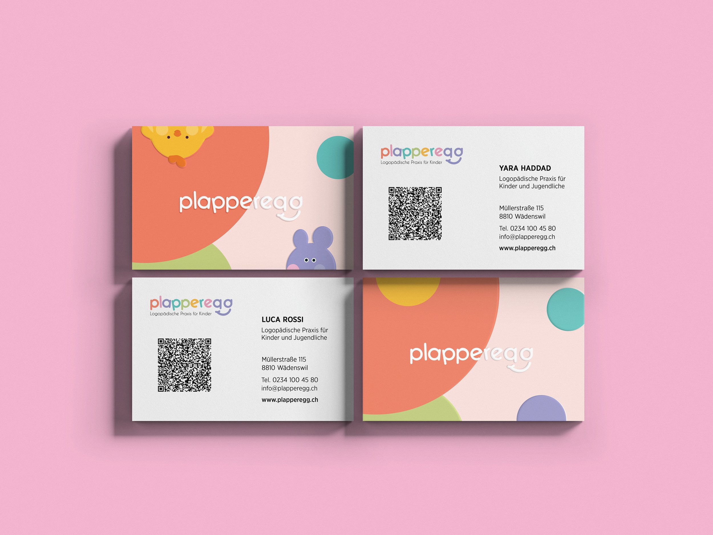
APPLICATIONS
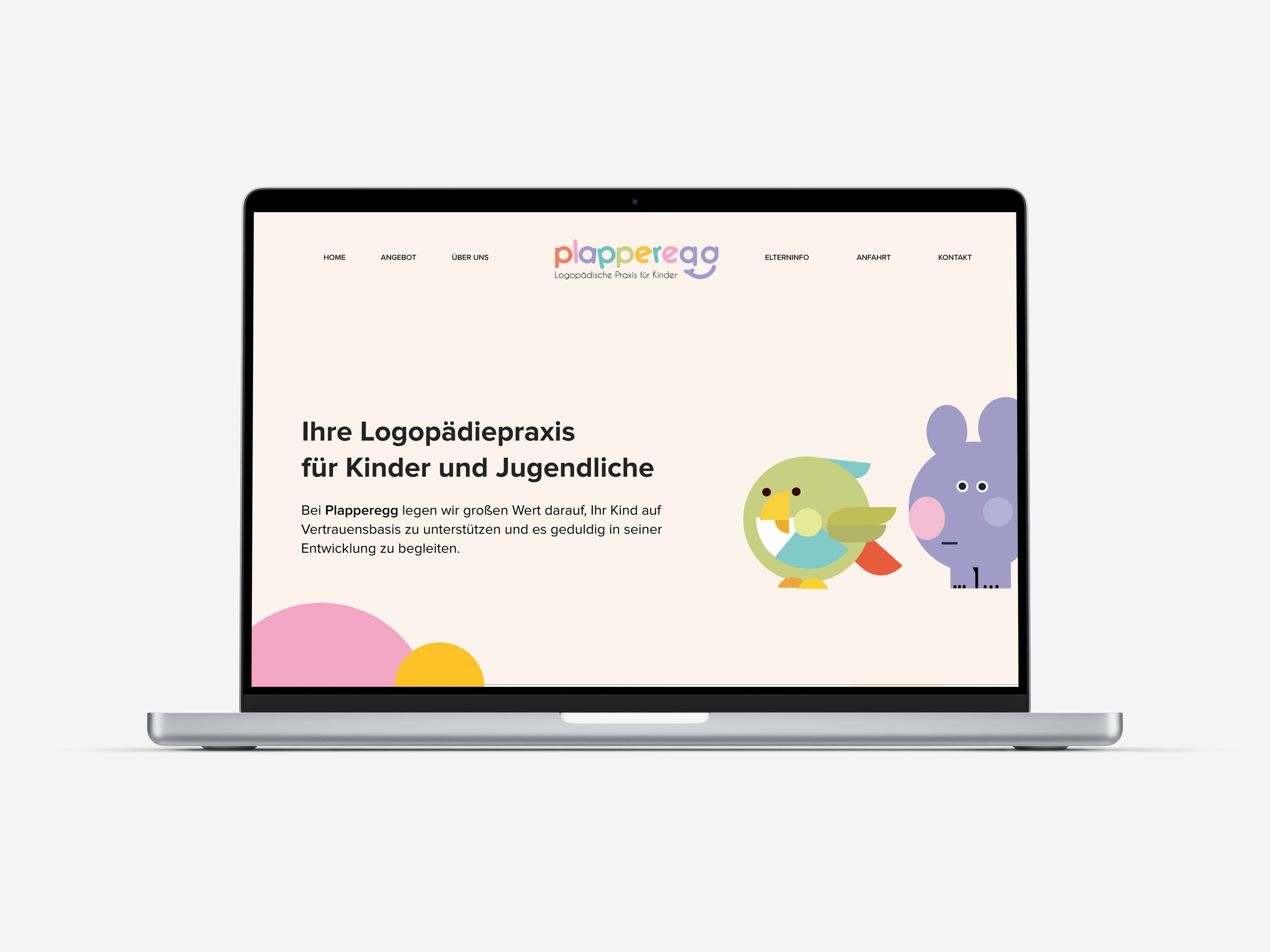
Simple and child-friendly: The design system can be effortlessly applied to all relevant touchpoints – from posters and websites to stationery.