Ein Eltern Familien - Netzwerk Berlin
Naming, Logo, Brand Identity, Website Design,
Stationary & Marketing Collateral
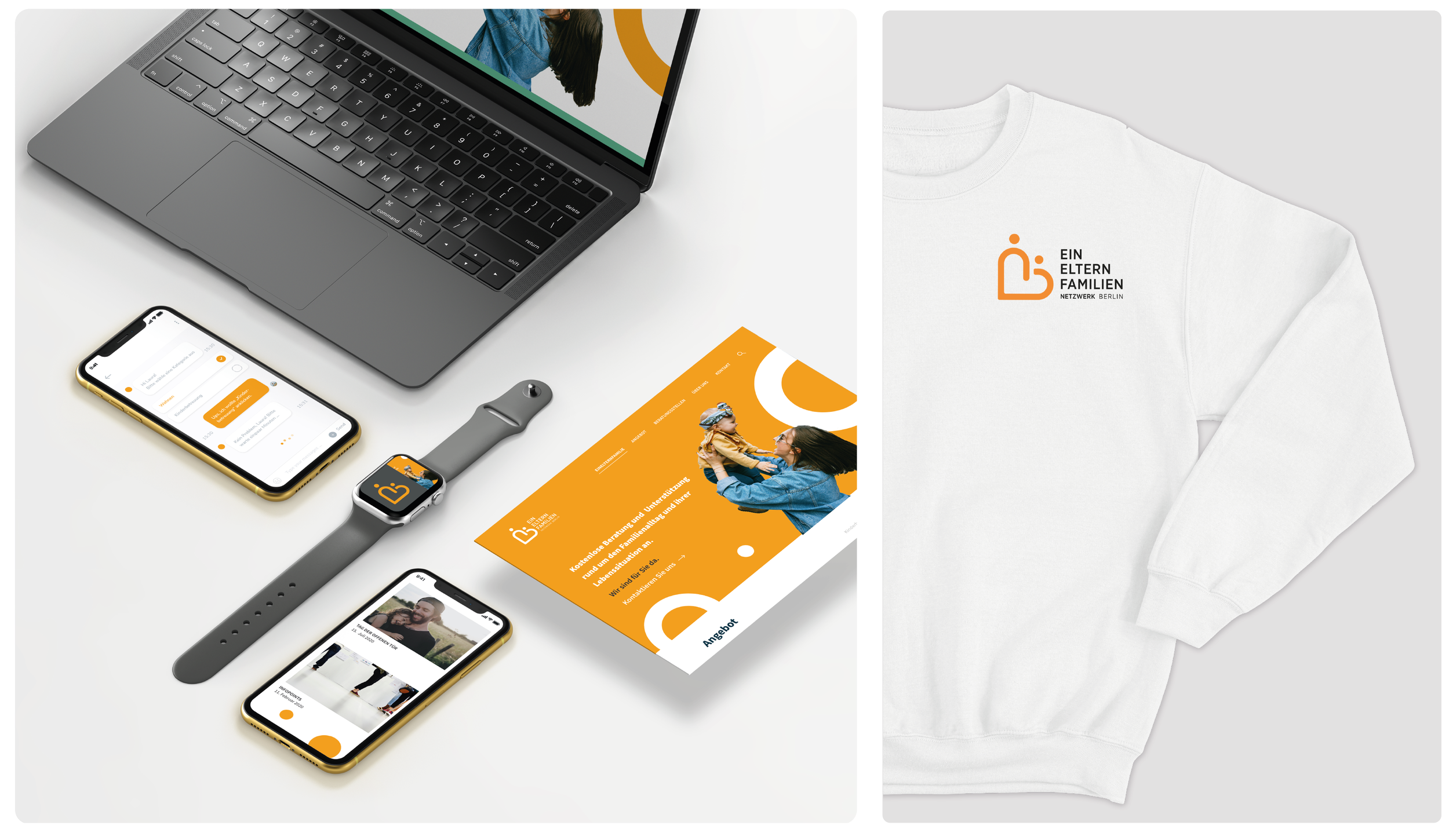
The Single Parents Network Berlin sought a name and brand design that reflects the specific needs of single parents in the capital. Berlin has the highest number of single-parent households in Germany. The goal of my project was to develop a cohesive corporate design that clearly and appealingly communicates the network's diverse support services. The project is supported by the Senate Department for Labor, Social Affairs, Equality, Integration, Diversity, and Anti-Discrimination to improve the coordination and networking of support services.
NAMING
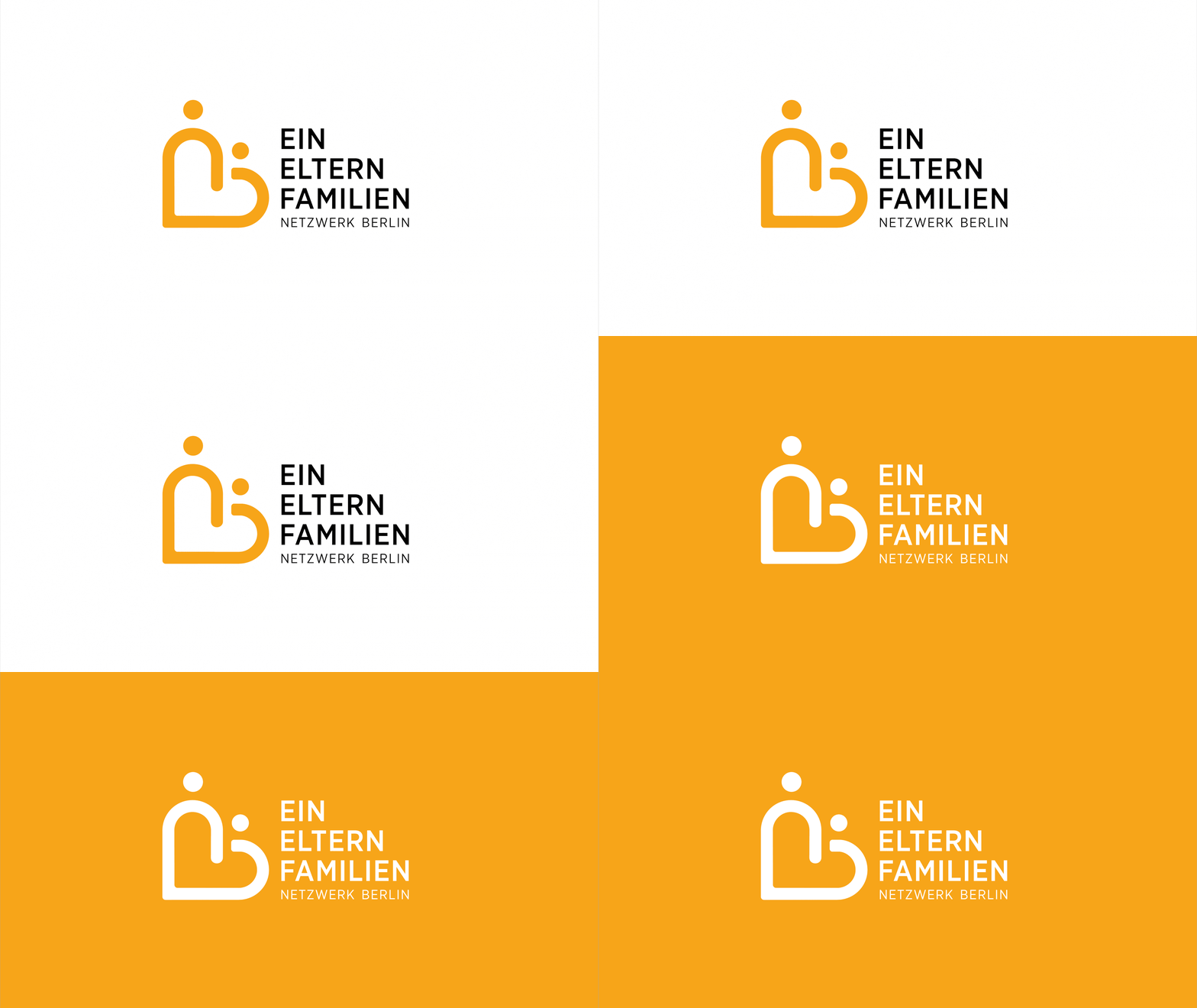
From "Alleinerziehenden Netzwerk Berlin" emerged the name "Ein Eltern Familien-Netzwerk Berlin". The name says it all: it signifies community and support for single parents and their children, a place of safety and invitation in Berlin.
LOGO
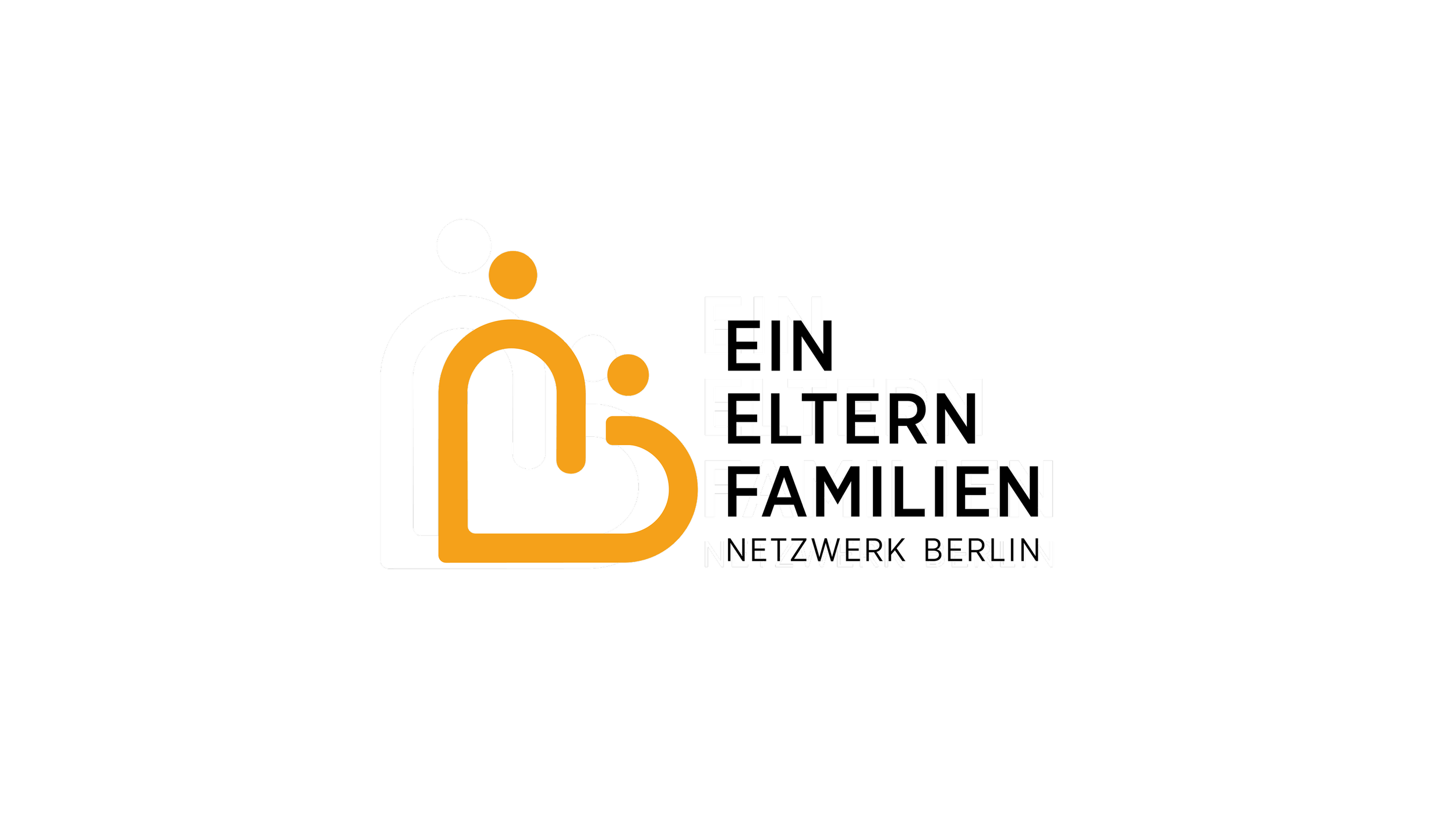
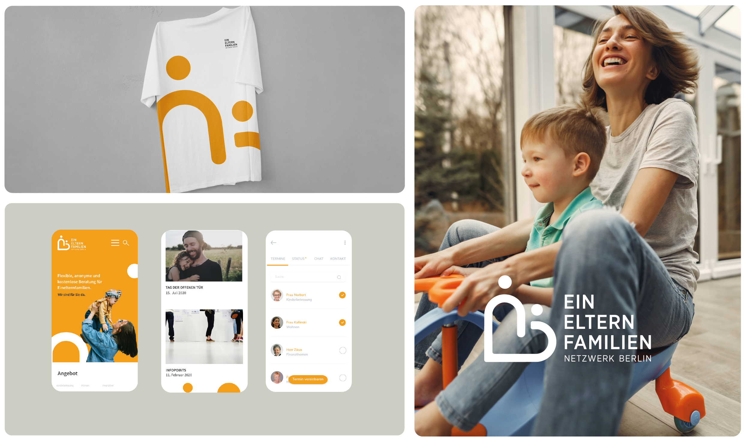
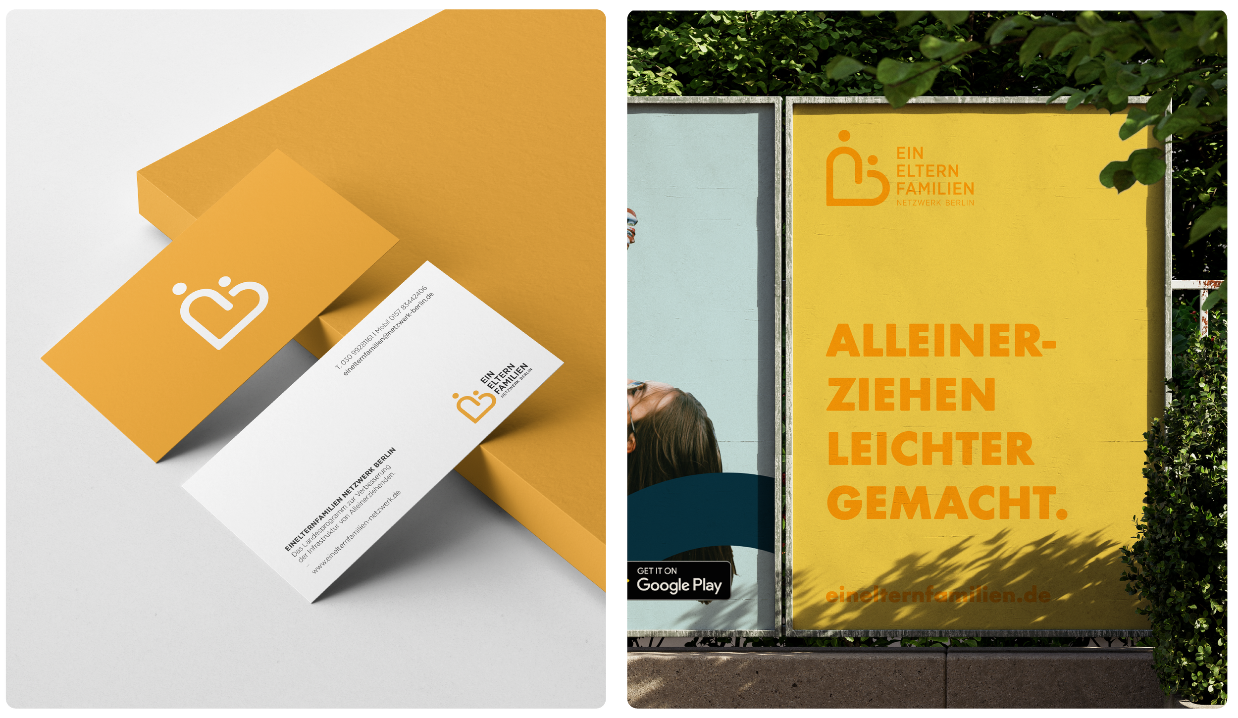
The wordmark appears friendly and inviting due to its rounded design. The logo for "Ein Eltern Familien Netzwerk Berlin" features two stylized figures — a parent and a child — symbolizing care and togetherness.

COLOUR SCHEME
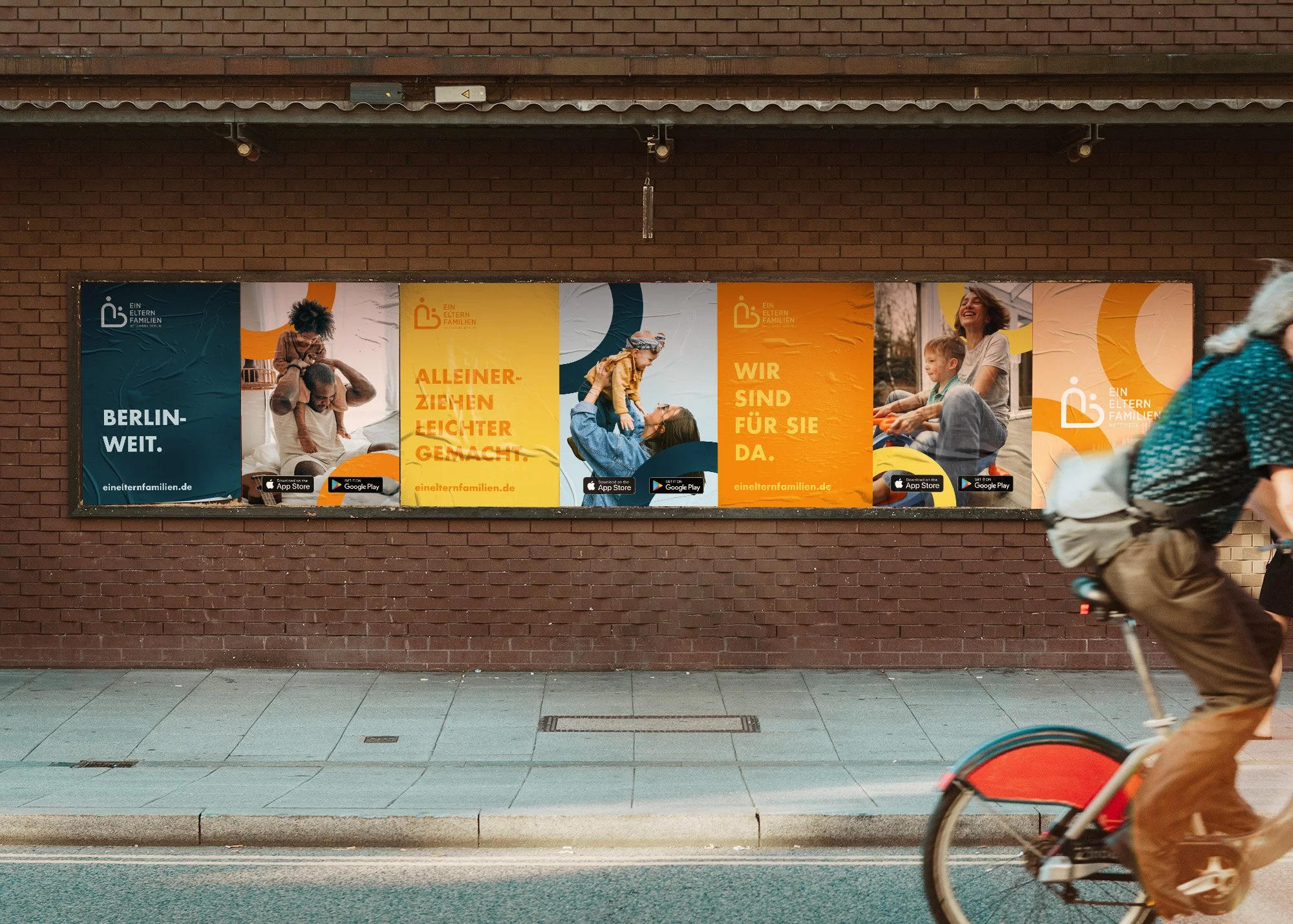
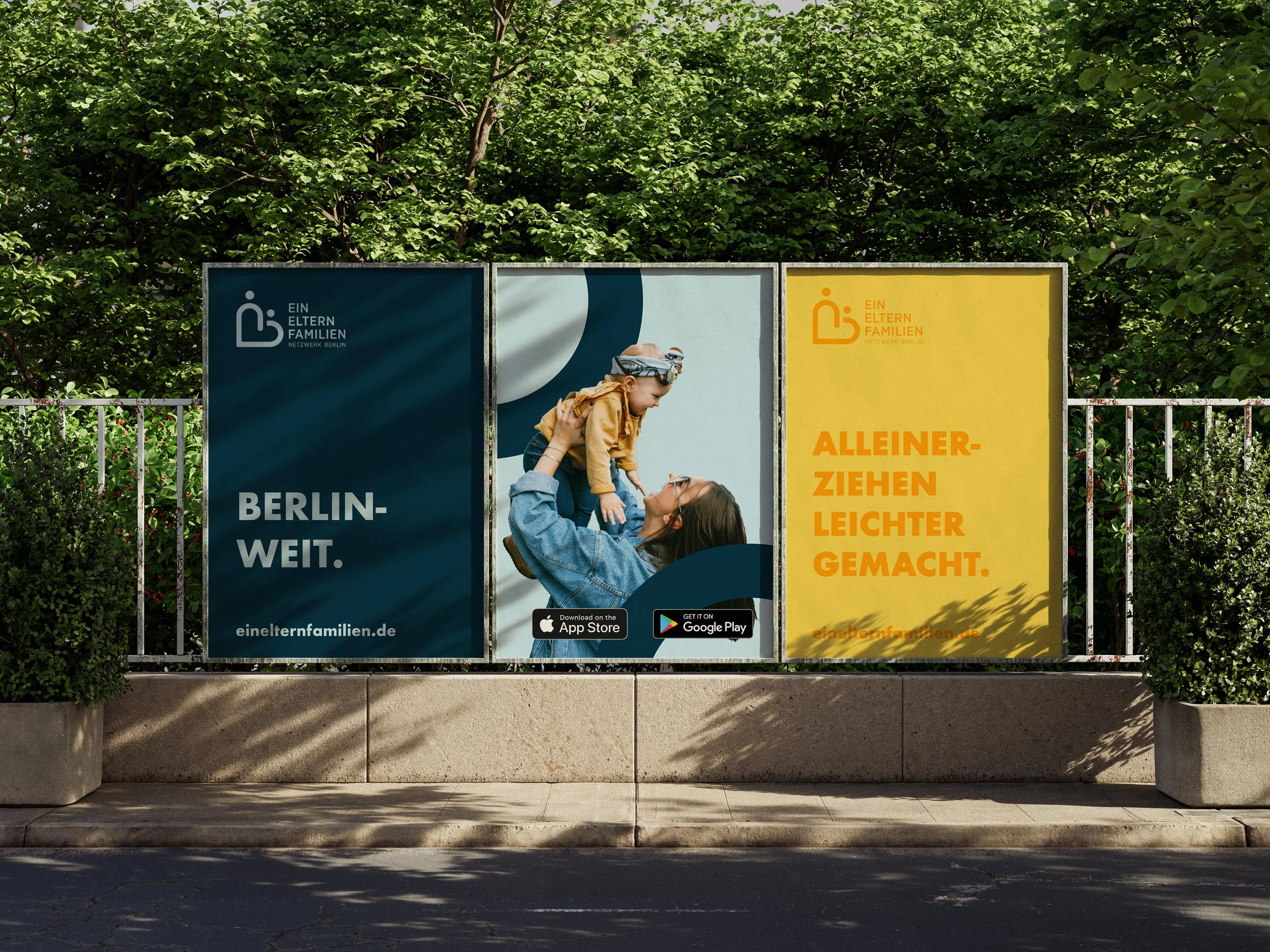
The vibrant, welcoming colour scheme features warm and cool tones, creating a balance of warmth and professionalism.

KEY VISUAL
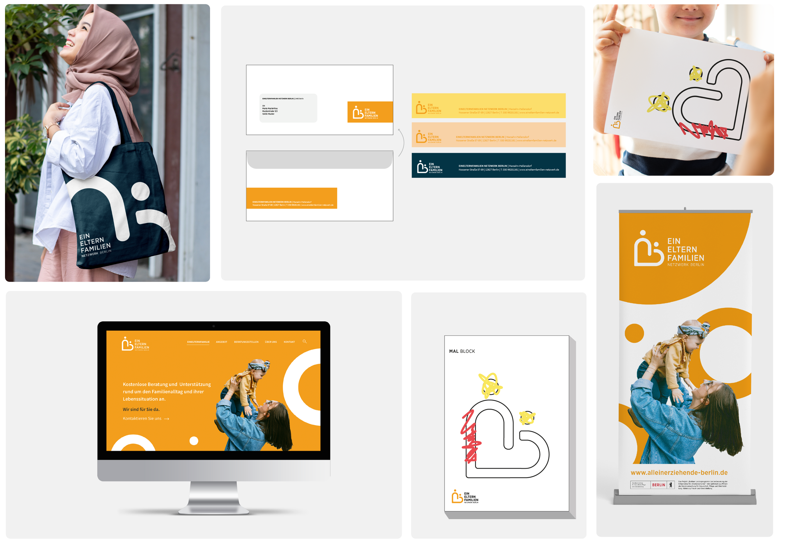
The rounded shapes form the basis for developing the key visuals. Simplified and recognisable, they create a unique design system.

IMAGERY STYLE
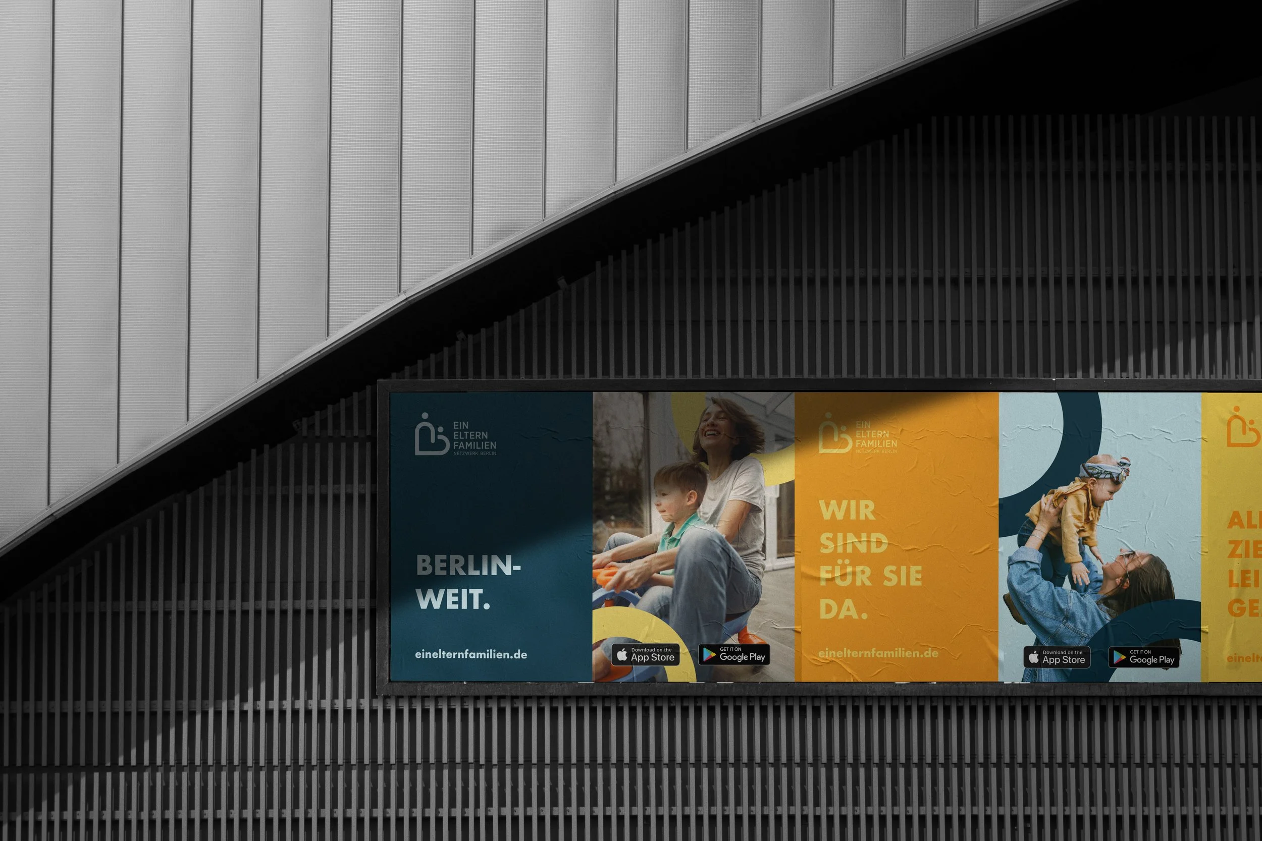
These close-range photos highlight the supportive and joyful environment of single-parent families, emphasizing warmth and connection.
TYPOGRAPHY
A clean, rounded typography emphasizes the approachable and friendly character of the network
BRAND GUIDELINE
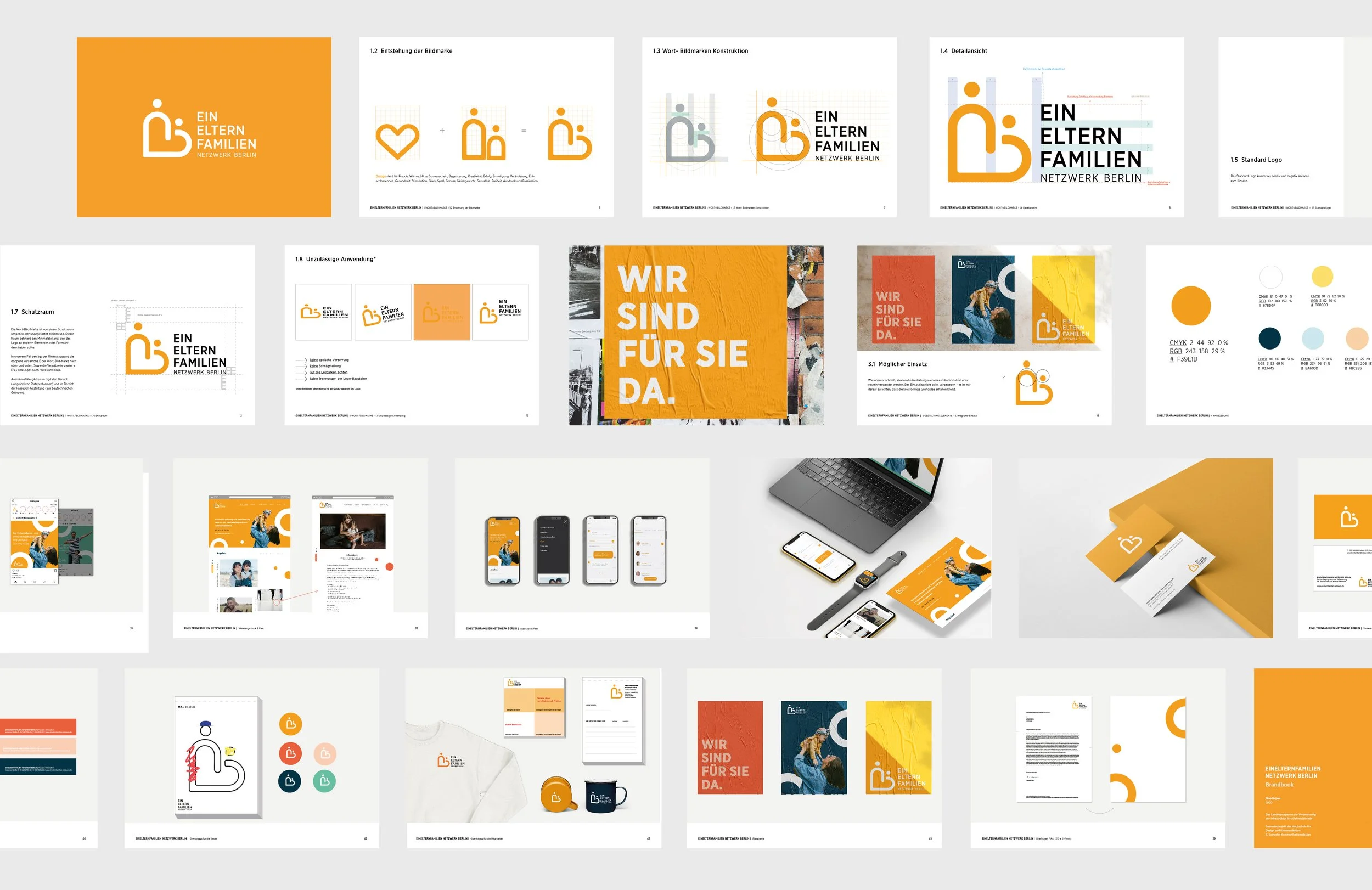
The brand guideline enables employees and external partners to consistently apply design and messaging.